the music in all of us
Music has always been a big part of my life and specially french rap music. It was naturally that I choosed him and his album Civilisation to make a music showcase.

When Orelsan made his post-lockdown comeback with Civilisation, he delivered a truly special album with remarkable artistic direction. One of its most distinctive features was the unique visual design of each track’s disc, a level of attention to detail rarely seen in modern music releases. This work deserved more recognition, so I decided to create a dedicated interactive website where users could both listen to the tracks and explore the stunning visuals that accompanied them.
A Creative Tribute
As part of the Music PLZ project, I wanted to pay tribute to this visual and conceptual masterpiece—while adding my own creative spin. Drawing from my expertise in creative design and web development, I aimed to craft a fully immersive experience that mirrors Orelsan’s unique aesthetic.
The goal was simple: to translate the album’s strong visual identity into a modern, interactive, and fluid website that enhances user engagement. The challenge? Finding the right balance between design accuracy, smooth animations, and optimal performance across all devices.
Typography, Colors & Symbolism
Finding the Perfect Match
One of the first challenges was identifying the right typography—a crucial detail to maintain the album’s strong branding. After extensive research, I found Changeling Neo, a futuristic typeface that closely resembles the one used in Civilisation.
✅ Typography locked in.
Me, when I finally found that typography.
Colorful life
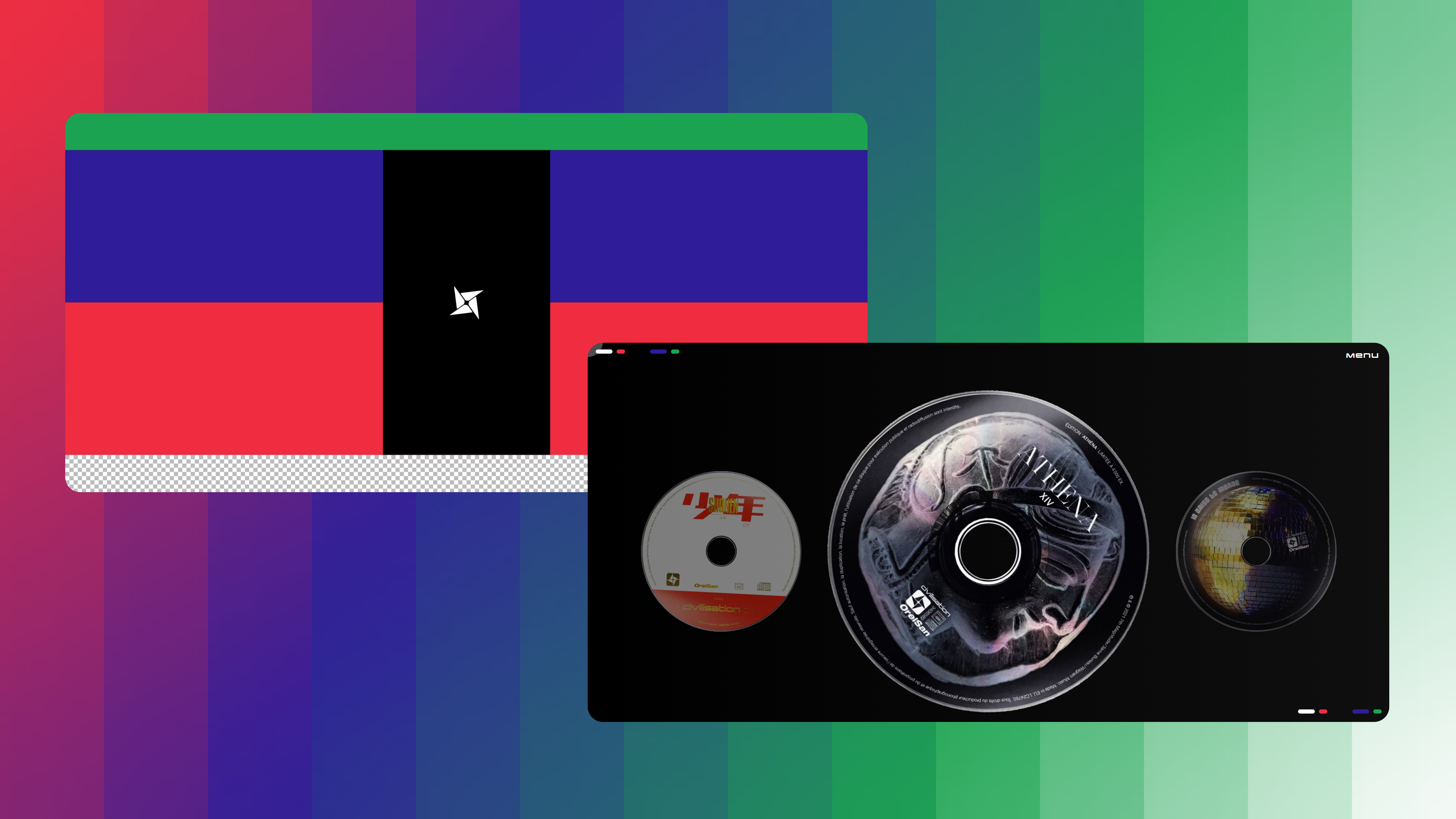
Orelsan’s album features a distinct dark, high-contrast visual theme. The main design elements include:
- A nearly black background to enhance contrast
- Three highly saturated colors:
- 🟢 Green: Symbolizing nature & environmental awareness
- 🔵🔴 Blue & Red: Representing France, the main setting of Orelsan’s lyrics
- ⚫⚪ Checkered white-and-gray pattern: Mimicking Photoshop’s transparency background, symbolizing creative freedom
These colors are integral to the visual storytelling of the album, forming a flag that Orelsan wears like a superhero cape during his tour.
At the center of this aesthetic is a shuriken symbol, which carries dual symbolism:
- A weapon for defense, representing resilience
- A guiding star, symbolizing hope and direction
✅ Colors and symbolism translated to web design.
Me, as a robot, checking another part of the project.
Artistic Direction to Life
Animating the Album’s CDs
Since each track in Civilisation was given a custom-designed CD, I wanted to replicate this artistic effort digitally. To do this, I:
- Scanned and digitally recreated each unique disc design
- Programmed an interactive rotation effect to simulate CDs spinning when selected
- Added a hover interaction so users feel the tactile sensation of handling a real disc
Seamless & Accessible Navigation
To keep the user experience smooth and intuitive, the website was designed to be fully navigable using three input methods:
✔ Keyboard (Arrow keys for navigation, Enter for selection)
✔ Mouse (Click-and-drag functionality)
✔ Touchscreen (Swipe and tap gestures for mobile users)
This ensures accessibility across all devices—from desktops to tablets and smartphones.
Bring me to life
GSAP for Smooth Animations
To achieve fluid animations and high-performance interactions, I used GSAP (GreenSock Animation Platform). Key GSAP features implemented:
✔ Scroll-based animations for immersive transitions
✔ Timeline sequences to control the flag reveal animation step by step
✔ Optimized rendering to ensure smooth performance, even on mobile
Optimized Web Performance
With so many visual elements, animations, and interactive features, performance was a top priority. Key optimizations included:
✔ Lazy loading images to improve initial load times
✔ CSS animations fallback for users with lower processing power
✔ Minimal JavaScript footprint to ensure fast interactions
Responsive & Mobile-First Approach
Since most users access websites from mobile devices, I prioritized a mobile-first design:
✔ Flexbox & Grid layouts for adaptable scaling
✔ SVG elements to maintain sharpness at any resolution
✔ Fast touch responses for seamless mobile interactions
✅ Website ready for all screen sizes and devices.
Help me I can’t stop.
Let’s go
The Civilisation album is a visual and musical masterpiece, and this project was my way of paying tribute to its artistic depth. By combining design accuracy, interactive animations, and seamless performance, I aimed to create a digital experience that truly honors Orelsan’s vision.
But enough talking—experience it for yourself!
If you’d like to check out another cool school project that i did that is not related to reading, I recommend Colibri or Talk It Out.