Reading better
Reading as become again more and more popular and people still struggle to find an app that really understand them as readers.

For me, the best way to learn new things is by reading a lot about a certain topic. So naturally, I spent a lot of my time piling up endless reading lists. Soon enough, I realized that I needed to organize all of this.
A reading journal is the simplest and most commonly used way is to keep your library organised. The problem with this kind of method is all the time wasted creating and maintaining that journal.
The second way to do this is simply to find a virtual library app. There are several, like Bookshelf, Goodreads, and many other well-known ones in the community, but most of these apps offer some features while none provide all the most important ones.
following user needs
Working with the end user in mind is something very important when it comes to user experience. I first had to study the market I wanted to enter and see what people were looking for. So, I went to a place where I knew I could find a large sample of people: our friend Facebook.

By browsing through various reading groups of all ages, I was able to collect a significant number of responses, and I found out what people really wanted:
- A virtual library that catalogs their entire collection
- Personalized recommendations based on the books they have registered
- Support for manga and comic books
- Sharing their readings on different social networks
Maximum effort (?)
It was high time to dive into something concrete, with the first step being to define a unique identity for this new application. The next step in my project is all about delivering maximum results with minimal effort. As my MVP (Minimum Viable Product), I created a simple Notion page that includes the first core feature: a personal library.

This feature allows users to organize their books by genre, reading start and end dates, and other customizable details. All this information is stored in a neatly structured list on the website. The data feeds into another database that tracks books by genre or reading progress relative to a set “goal.” It also lets users store inspiring quotes or reading challenges.
By focusing on these basic functionalities, I’m able to test the app with minimal effort while drawing valuable insights. After testing it with a few users, I’ve compiled a list of improvements for the app itself. More importantly, I discovered that users were intrigued by the idea, as most reading apps on the market currently don’t offer anything similar.
These tests have been highly successful, allowing me to gather insights on how to continue developing the project. I’ve learned what users understand, what they’re seeking in terms of core features, and how to tailor the app to different types of readers.

With this in mind, I think it’s essential to create a list of reader types (occasional readers, collector readers, avid readers). This will help shape the app’s direction while ensuring that the needs of all users are met. From here, we can move toward defining the user journey.
Reading can be beautiful
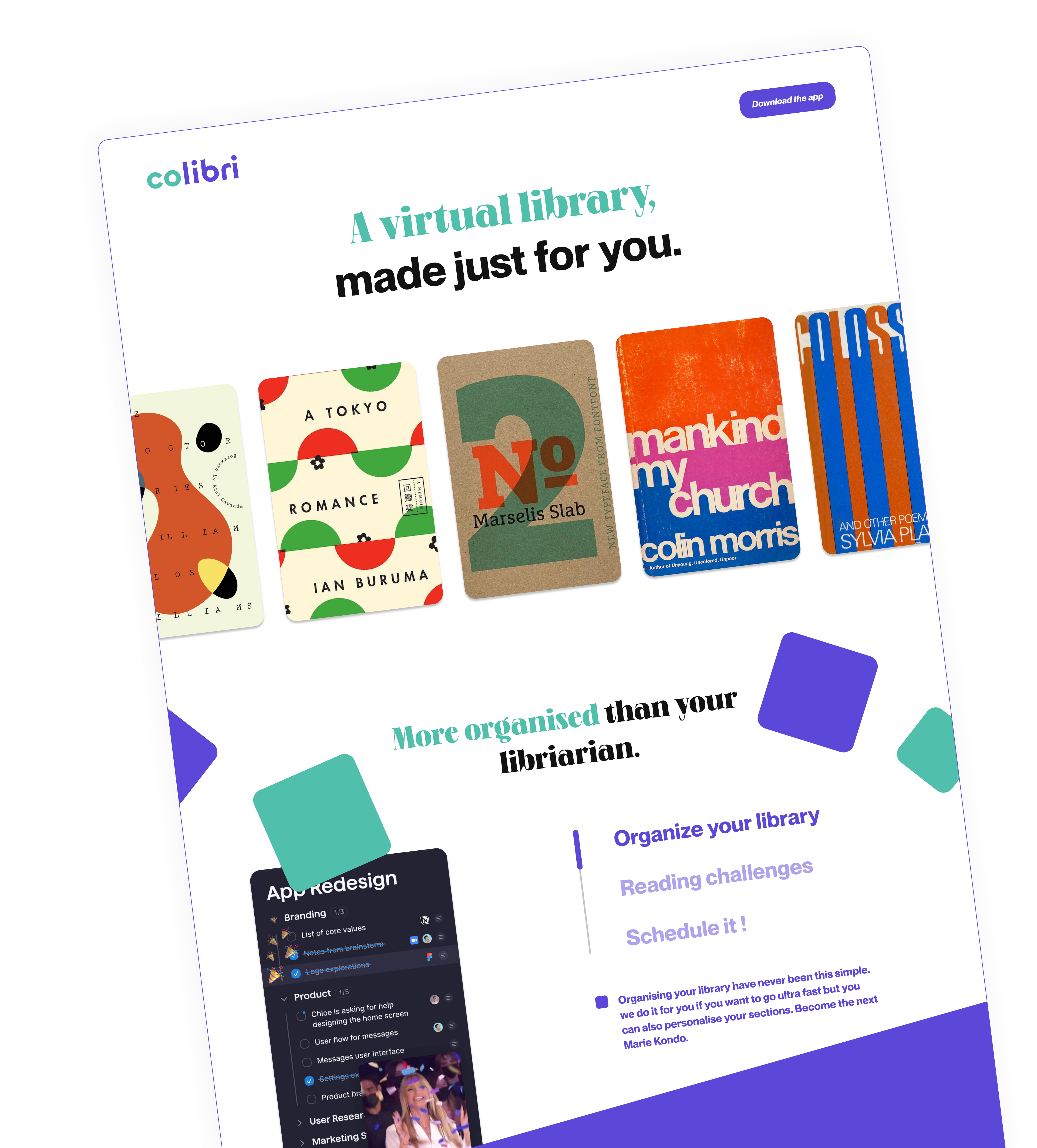
When defining the identity of my app, I chose the name “Colibri,” inspired by the swift and discreet hummingbird, a word in French (because, let’s face it, French and reading go hand in hand). Hummingbirds, or Trochilidae, encompass 340 species commonly referred to as “hummingbirds” of various sizes and colors.

Our app embodies this concept: a personalized Colibri that is fast, discreet, and allows users to seamlessly manage and consolidate their physical or virtual library with ease.
The color change separates “co” from “libri.”. “Co” highlights the social network aspect of the app, where users can share libraries, and “libri” means “books” in roman. Colibri is a customized library management tool, perfectly designed for organizing both physical and digital book collections.
After researching competitors in the market, I noticed that most library management apps and websites had a somewhat outdated, cluttered look—reminiscent of an old book. I decided to go in a different direction with a modern, clean design to revamp the experience.
For the app’s style, I selected simple geometric shapes and a limited color palette of two main colors. The soothing soft green brings a sense of calm, similar to the feeling you get while reading, while the purple adds to this tranquility, creating an ideal environment for library organization. These colors are also a nod to the common green and purple hummingbirds.
V0.0.1 or prototype if you prefer
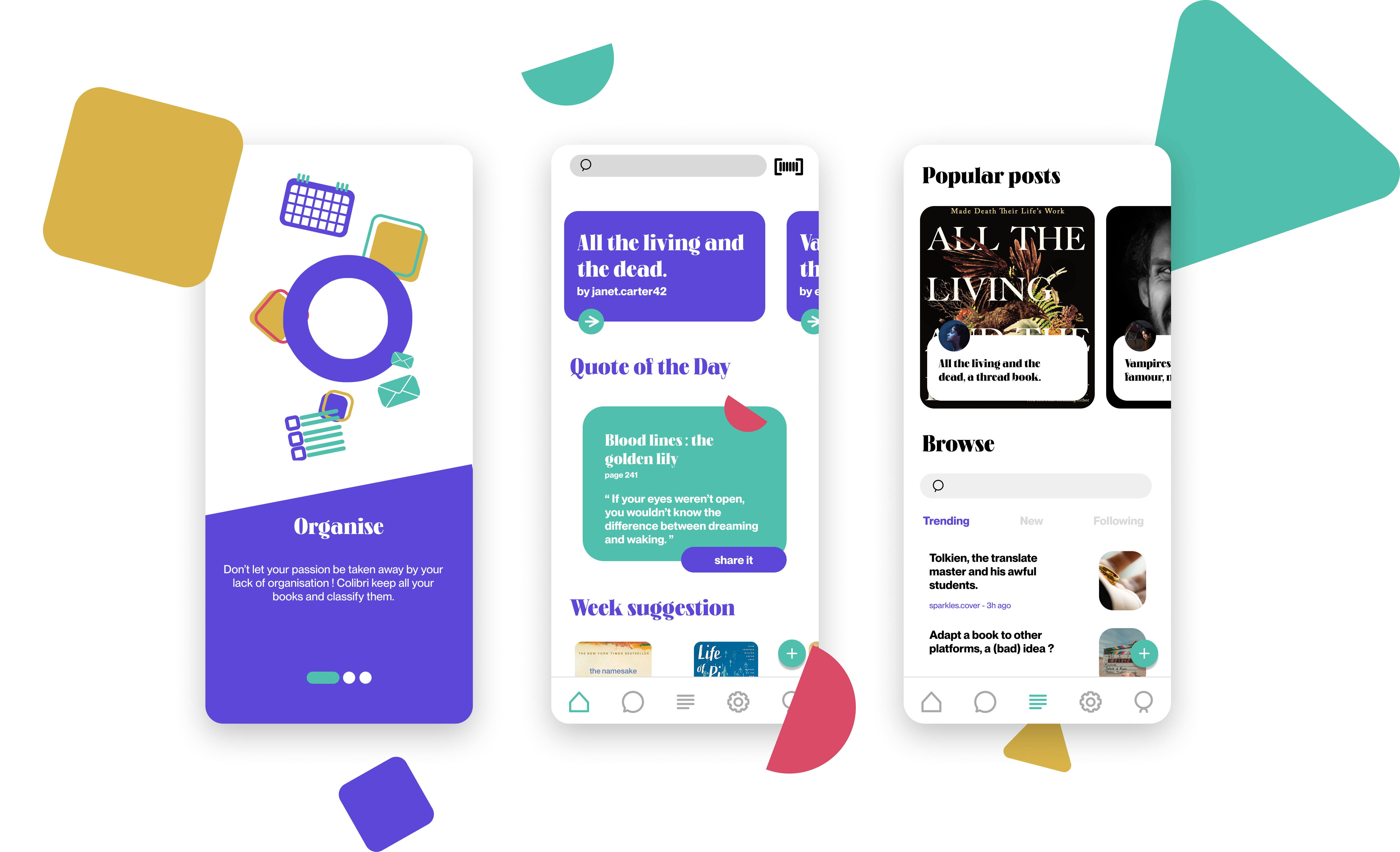
For the first prototype, I’m focusing exclusively on UX (user experience), so no design for now—that will come later. I’ve created the various pages typically found in a standard app: the home page, settings, and profile. Next, I moved on to the pages unique to my project: posts, book scanning, and the personal library (including quotes and personal challenges).
User testing led me to make several improvements to the app itself: a more accurate news feed, a featured quote on the home page, a log-out and block function, a functional search bar, and a follow feature.
The grand finale
The most rewarding part of the work is always when it’s finished, and you can finally show what it’s all about. So… enjoy.
If you’d like to check out another cool school project that i did that is not related to reading, I recommend Music Plz or Talk It Out.